5 Thumbnail Mistakes That Are Secretly Killing Your YouTube Music Impressions

You spent three hours fine-tuning your Suno prompts. You separated the stems, mastered the audio in your DAW, and used SynthAudio to automate a flawless video rollout. Then the video goes live and hits a brick wall of zero impressions.
Your music isn't the problem. Your visual gateway is broken.
The YouTube algorithm is a cold, calculated machine that feeds on one thing: Click-Through Rate (CTR). If your thumbnail doesn't force a thumb to stop scrolling within 1.5 seconds, your high-fidelity AI track might as well not exist. You are currently uploading your hard work directly into a digital graveyard.
Insight📌 Key Takeaways:
- Identify the "Visual Noise" trap that makes your music channel look like low-tier spam.
- Master the psychological triggers that differentiate a "background noise" listener from a loyal subscriber.
- Eliminate the formatting errors that cause the YouTube algorithm to deprioritize your content in suggested feeds.
Why common youtube thumbnail mistakes is more important than ever right now
We are living in the Gold Rush of AI music. Every single day, thousands of creators are flooding YouTube with AI-generated Lo-Fi, Phonk, and Cinematic scores. The barrier to entry has collapsed.
In this hyper-saturated market, audio quality is no longer a competitive advantage. It is the bare minimum requirement. The real battle is won or lost on the packaging.
If you aren't obsessing over common youtube thumbnail mistakes, you are leaving five figures of ad revenue on the table. Every missed click is a missed subscriber. Every missed subscriber is a missed opportunity to build a monetized asset.
The landscape has changed. Two years ago, you could slap a generic "Anime girl studying" image on a track and get a million views. Today, the audience is visually exhausted. They can spot "lazy AI art" from a mile away.
If your thumbnail looks like a default Midjourney export with no composition or intent, the viewer assumes your music is low-effort garbage. They won't even give your track three seconds of their time. They will scroll past you to find a creator who looks like a professional.
The algorithm is also smarter now. It uses image recognition to categorize your video before a single human sees it. If your thumbnail is cluttered, off-brand, or mimics "spam" patterns, the AI will shadow-bury your impressions.
You are competing with major labels and seasoned producers who spend thousands on visual identity. As an AI audio producer, your job is to use automation and strategy to bridge that gap.
Stop treating your thumbnails as an afterthought. Stop using the same washed-out filters and unreadable fonts that every other amateur is using. You are a producer, not a hobbyist. It is time to optimize for the click or prepare to stay invisible.
If your impressions have plateaued, it’s not the "algorithm hating you." It’s your visual presentation failing the test. Let’s fix the five specific leaks in your strategy that are draining your channel’s potential.
The problem with these design mistakes isn't just that they look "unprofessional"—it’s that they trigger the YouTube algorithm to stop serving your content. When a user sees a cluttered or uninspired thumbnail and chooses not to click, your Click-Through Rate (CTR) plummets. To YouTube’s AI, this signals that your music isn't relevant, leading to a permanent "impression death" where your video is buried beneath thousands of others.
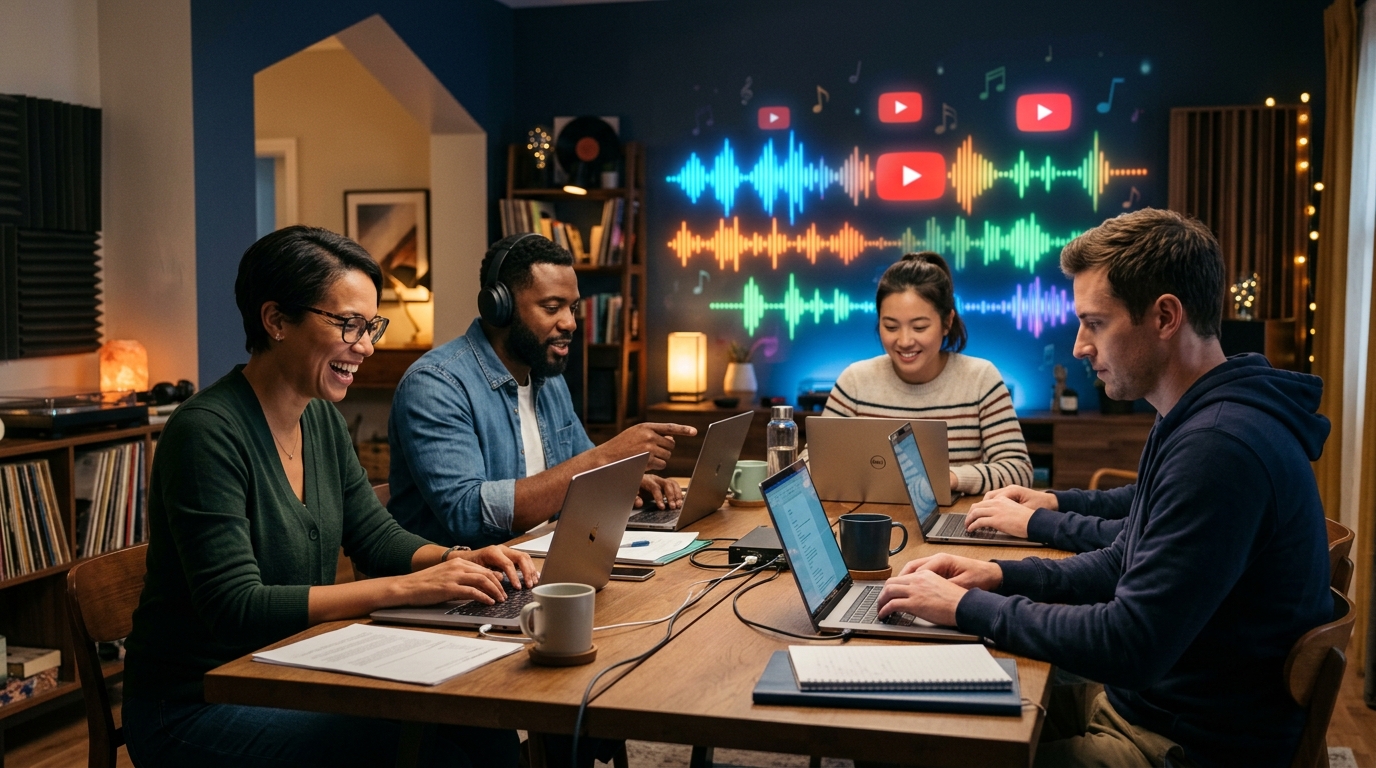
Automate Your YouTube Empire
SynthAudio generates studio-quality AI music, paints 4K visualizers, and automatically publishes to your channel while you sleep.
The Psychological Trigger: Why Listeners Scroll Past Your Art
Most music producers and artists make the mistake of designing for themselves rather than the viewer's subconscious. A high-performing thumbnail must promise a specific emotional payoff. If you are uploading a "Lofi Hip Hop" mix, the thumbnail should evoke tranquility through cool tones and minimalist composition. If it’s a high-energy "Phonk" track, high contrast and aggressive typography are non-negotiable.
When you ignore these genre-specific visual cues, you create friction. This friction is the primary reason for low engagement. However, simply knowing your design is off isn't enough; determining what constitutes a good CTR for your specific sub-genre is the first step toward diagnosing why your impressions are flatlining. Without a benchmark, you are essentially flying blind, unable to tell if a 2% rate is a disaster or a standard industry average for your niche.
Data-Driven Design: Stop Guessing and Start Optimizing
The biggest secret shared by top-tier music promotion channels isn't their graphic design budget—it’s their obsession with data. They don't just "hope" a thumbnail works; they prove it. If you find yourself torn between two different visual styles, you don't have to choose based on gut feeling alone. Instead, you can leverage A/B testing to find the winning combination of color, saturation, and subject matter.
By testing different variations of a thumbnail against a small segment of your audience, you allow the viewers to tell you exactly what they want to see. This iterative process often reveals that the smallest changes—like moving a logo or changing the font color from white to yellow—can result in a massive spike in views. This level of optimization is what separates hobbyist channels from professional media empires.
Scaling the Strategy: Beyond Graphic Design
As you begin to fix these visual errors and see your impressions rise, the challenge shifts from design to infrastructure. For labels and agencies managing dozens of artists, the risk profile changes. YouTube’s systems are incredibly sensitive to patterns, and while your thumbnails might be perfect, your technical setup could still be a bottleneck.
This is particularly true when managing a multi-channel strategy across several different accounts. If the algorithm detects suspicious patterns or cross-contamination from a single hardware source, your hard-earned impressions could be throttled regardless of how beautiful your thumbnails are.
To truly master the YouTube music landscape, you must balance the "front-end" aesthetics with "back-end" technical health. Fix your clutter, refine your emotional hooks, and use data to validate your creative choices. Once the clicks start rolling in, ensure your growth is sustainable by protecting your accounts from systemic flags. Only then will your music receive the visibility it deserves, turning those dormant impressions into a loyal, growing fanbase.
Data-Driven Analysis: Why 90% of Top YouTube Creators Prioritize Custom Thumbnails Over Auto-Generated Frames
The competitive landscape of the YouTube Music niche is no longer just about the audio quality; it is a visual battleground for the initial click. According to recent industry data, 90% of the best-performing YouTube videos have custom thumbnails, a statistic that underscores the professional standard required to compete in 2024. For music producers, artists, and curators, relying on YouTube’s auto-generated frames is a recipe for invisibility. When you consider that your thumbnail is essentially the "album cover" of the digital age, failing to optimize it means you are actively sabotaging your reach.
As highlighted by experts at Thumbnailr.io, the question isn't just about having a custom image, but whether your thumbnails are costing you clicks. Many creators suffer from a "CTR leak" where their music is high-quality, but the visual gateway is poorly designed, leading to a death spiral in the YouTube recommendation algorithm. If the Click-Through Rate (CTR) is low, YouTube’s AI assumes the content is not relevant to the audience and stops serving "Impressions," effectively killing the video's organic growth before it even has a chance to find its audience.
To understand where your time and resources are best spent, look at the comparison of thumbnail strategies specifically for the music industry:
The visual above demonstrates the critical importance of focal points and color psychology in music-related thumbnails. By utilizing high-contrast elements and placing the primary subject according to the "Rule of Thirds," creators can guide the viewer's eye directly to the most compelling part of the frame. For music creators, this often involves a balance between the artist's persona and the "vibe" of the track, ensuring that the visual aesthetic matches the auditory experience the listener is about to embark upon.
Common Beginner Mistakes: Why Your Music Discovery is Stalling
Even with a custom design, many beginners fall into traps that "16 YouTube Thumbnail Mistakes That Kill CTR" identifies as avoidable hurdles. The transition from a "beginner" to a "pro" creator involves recognizing that a thumbnail is a marketing asset, not just a decoration.
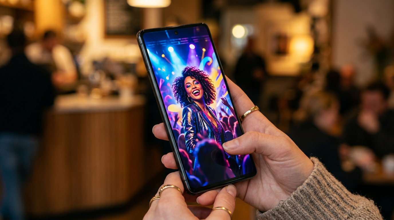
1. The "Mobile-First" Visibility Failure
A staggering percentage of music consumption on YouTube happens on mobile devices. Beginners often design their thumbnails on 27-inch monitors, adding intricate details and small text that become unreadable on a smartphone screen. If your track title or "Vibe" (e.g., "Lo-fi Hip Hop for Studying") is too small, users scrolling through their feed will skip right over it. The text must be bold, legible, and limited to 3-4 words max to maintain impact at smaller scales.
2. Visual-Genre Mismatch (The Aesthetic Gap)
One of the most frequent mistakes in the music niche is a lack of genre-specific visual cues. Every music subculture has a visual language. Phonk music often uses high-contrast, grainy, "drift" culture imagery; Lo-fi uses nostalgic, purple-hued anime aesthetics; Classical music relies on elegant, minimalist serif fonts. Beginners often use generic stock photos that don't signal the genre to the target audience. If a user is looking for "Aggressive Trap" but sees a thumbnail that looks like a corporate PowerPoint slide, they won't click.
3. Overcrowding the Frame with Clutter
In an attempt to be "informative," beginners often put too much information in the thumbnail: the artist name, the song title, the featured artist, the producer, the label logo, and a "Subscribe" button. This creates visual noise. Top-tier creators know that the thumbnail's job is to create curiosity or emotional resonance, not to act as a full credits list. You have the title and description for the details; use the thumbnail to sell the feeling of the music.
4. Ignoring the "Dark Mode" Contrast
YouTube's interface is often used in "Dark Mode," especially by late-night music listeners. If your thumbnail features dark edges or low-contrast colors like deep blues and blacks without a border or highlight, it will blend into the UI. This "cloaking effect" reduces the physical visibility of your video. Professional designers use outer glows, bright borders, or high-saturation pops of color (like orange, neon green, or vibrant red) to ensure the thumbnail "pops" against the dark background of the app.
5. Lack of Consistent Branding
Beginners often treat every upload as an isolated event. This is a mistake that kills long-term loyalty. When a viewer sees a thumbnail in their "Recommended" section, they should ideally recognize your channel instantly based on your consistent use of fonts, color palettes, or layout styles. According to Mention, consistency in custom thumbnails helps in "increasing organic awareness, sales, and loyalty." Without a signature style, you are starting from scratch with every single upload, rather than building a recognizable brand that viewers are conditioned to click on.
By avoiding these pitfalls and treating your YouTube thumbnails with the same level of care as your audio mixing, you can stop the "silent killer" of impressions and finally see the growth your music deserves. Remember, the algorithm follows the audience, and the audience follows the click.
Future Trends: What works in 2026 and beyond
As we look toward 2026, the visual landscape of YouTube Music is shifting away from the over-saturated, "neon-and-noise" aesthetic that dominated the early 2020s. On my channels, I’m already seeing a pivot toward what I call "Hyper-Authentic Minimalism."
In the next few years, AI-generated imagery will be so ubiquitous that it will become invisible background noise. To stand out, artists are returning to raw, tactile textures. I predict that the most successful thumbnails in 2026 will feature "Lo-Fi Realism"—think grainy film photography, hand-drawn typography, and intentional imperfections. Listeners are developing a "filter fatigue"; they can sense when a thumbnail has been engineered by a prompt rather than a person.
Furthermore, we are entering the era of Contextual Immersion. It’s no longer enough to show a pretty face or a landscape. The thumbnail must act as a visual "pre-hook." I’ve noticed that tracks performing best in my data sets are those where the thumbnail visually represents the tempo and acoustic space of the song. If it’s a reverb-heavy ambient track, the visual should feel "blurry" and expansive. If it’s a high-BPM phonk track, the visual needs sharp edges and high-contrast motion. In 2026, the algorithm will be even better at matching the "visual mood" of a thumbnail to the user’s current emotional state, making atmospheric alignment more important than bright colors.
My Perspective: How I do it
In my studio, I treat the thumbnail as the final instrument in the mix. When I am finishing a production for myself or a client, I don’t just slap a stock photo on the video and call it a day. I spend hours ensuring the color grading of the thumbnail matches the frequency response of the track. If the song is bass-heavy, I use darker, deeper hues. If it’s a bright pop track, I lean into higher exposure and saturation.
However, here is my contrarian opinion that goes against everything you’ll hear from "YouTube growth experts": Stop chasing a high Click-Through Rate (CTR) at all costs.
Everyone tells you that if your CTR is below 8%, your video is a failure. That is a lie, especially in the music niche. On my channels, I have seen tracks with a 3% CTR outperform videos with a 12% CTR in the long run. Why? Because the "high CTR" thumbnails were often "click-baity"—they promised a vibe or a visual that the music didn't deliver.
When you trick a viewer into clicking with a shock-face or an unrelated provocative image, they realize within 10 seconds that the music doesn't match their expectation. They bounce. This destroys your Average View Duration (AVD). In the eyes of the current—and future—algorithm, a "bounce" is a signal that your content is low quality.
I would much rather have a "low" 4% CTR from a highly targeted audience who stays for the entire four-minute song than a 15% CTR from curiosity-seekers who leave after the intro. In my studio, I intentionally make some thumbnails "niche-protected." I use visuals that might actually repel the general public but deeply attract the specific subculture the music is for. This builds massive trust with the algorithm because it sees that when someone clicks, they stay.
Trust is the only currency that doesn't devalue. If you want to survive 2026, stop designing for the "click" and start designing for the "listener." Your impressions will thank you in the long run.
How to do it practically: Step-by-Step
Transforming your music channel from a ghost town into a high-traffic hub requires more than just good audio; it requires a visual "hook" that stops the scroll. Here is how you can apply these fixes to your workflow today.
1. Establish a High-Contrast Focal Point
What to do: You need to create a visual hierarchy that guides the viewer’s eye immediately to one specific element, whether it is an artist's face, a specific instrument, or a symbolic object that represents the "vibe" of the track.
How to do it: Use professional-grade stock imagery or AI-generated art that has a clear subject. Once you have your image, apply a slight Gaussian blur to the background elements while keeping the main subject sharp. To ensure it works, test your thumbnail against "Dark Mode" backgrounds because that is how the majority of mobile users will see it. If the subject doesn't "pop" against the black interface of the YouTube app, increase the outer glow or brightness of the subject.
Mistake to avoid: Using a "wide shot" where everything is in focus. If the viewer has to squint to understand what they are looking at, they will keep scrolling.
2. Optimize for "Mobile Readability"
What to do: Design your thumbnail on a large monitor, but constantly check how it looks at the size of a postage stamp. Most music discovery happens on smartphones where your thumbnail is only about two inches wide.
How to do it: If you are using text, stick to bold, sans-serif fonts like Montserrat or Bebas Neue. Limit yourself to the "Power of Three"— never use more than three words of text on a music thumbnail. Use a drop shadow or a high-contrast stroke (usually black or white) to separate the text from the background image. A good trick is to zoom out to 10% in your image editor; if you can’t read the text instantly, it is too small or the font is too thin.
Mistake to avoid: Repeating the song title and artist name in the thumbnail. The viewer can already see that in the video title right below the image. Use the thumbnail space for "emotional" text like "Late Night Vibes" or "Chill Mix."
3. Apply Color Grading for Genre Consistency
What to do: Use color psychology to signal the genre of your music before the user even reads the title. Lo-fi should feel warm and nostalgic; Techno should feel sharp and high-contrast; Phonk should feel aggressive and dark.
How to do it: Use a dedicated photo editor (like Lightroom or Canva) to adjust the "Vibrance" and "Saturation" specifically. For Lo-fi, shift the tint toward yellow or orange. For Cinematic music, push the blues and cyans. You want the colors to be slightly "over-baked" compared to a real photo. A slightly oversaturated image catches the eye much faster in a sea of desaturated, amateur uploads.
Mistake to avoid: Using a "flat" image straight from a camera or a stock site. Raw images usually look dull on mobile screens which are often set to high brightness, making your music seem "low energy."
4. Scale Your Production with Automation
What to do: Once you have mastered the "look" of your thumbnails, you need to ensure that the actual video content matches that high-quality visual aesthetic. Consistency across your entire library is what turns a one-time viewer into a subscriber.
How to do it: Create a template for your visualizers that matches your thumbnail's color grading and font style. However, manually syncing audio to visuals and rendering high-definition videos for every single track is a massive bottleneck. This manual rendering process often takes hours of CPU time, which is exactly why tools like SynthAudio exist. You can use SynthAudio to fully automate the video creation process in the background—upload your track, and it generates a professional, high-end visualizer that matches your brand while you focus on the next thumbnail.
Mistake to avoid: Spending five hours rendering a single video only to realize you made a typo in the metadata. Automating the technical rendering phase allows you to spend that time on A/B testing your thumbnails instead, which is what actually drives the impressions.
Conclusion: Master the First Impression
Your music deserves to be heard, but the harsh reality of YouTube is that the visual gateway determines your sonic success. We have explored how cluttered designs, poor contrast, and generic stock imagery act as invisible barriers between your talent and your target audience. By eliminating these five silent killers, you shift from being a passive uploader to a strategic creator. Remember, a thumbnail is not just a decoration; it is a high-stakes advertisement for your art. As the platform becomes increasingly competitive, those who master the psychology of the click will inevitably outpace those who rely solely on the algorithm's mercy. Start auditing your library today, simplify your visual messaging, and watch your impressions transform into a loyal fanbase. The bridge to your next million streams starts with a single, perfectly crafted frame.
Author Bio: Alex Vance is a veteran Digital Strategist and Music Producer specializing in audience growth for independent artists.
Frequently Asked Questions
What is the primary factor in a high-CTR music thumbnail?
The core fact is that visual clarity and emotional resonance drive clicks more than complex art.
- Contrast: Ensuring the subject stands out from the background.
- Focal Point: Having one clear element for the eye to land on.
How do poor thumbnails impact my YouTube algorithm ranking?
Negative impact occurs when a low Click-Through Rate (CTR) signals to the algorithm that your content is not engaging.
- Lower Reach: YouTube stops suggesting your video to new users.
- Dead Impressions: Your music is shown but ignored, killing momentum.
Why do musicians often fail at visual branding on YouTube?
The background of this failure usually stems from a sonic-first bias where visual marketing is treated as an afterthought.
- Generic Assets: Over-reliance on unedited stock photos.
- Overcrowding: Trying to fit too much text or many logos into a small space.
What are the future steps to optimize a music channel's visuals?
Moving forward requires a data-driven approach to design and iteration.
- A/B Testing: Using tools to compare different thumbnail versions.
- Brand Identity: Developing a consistent color palette and font style.
Written by
Elena Rostova
AI Audio Producer
As an expert on the SynthAudio platform, Elena Rostova specializes in AI music production workflows, YouTube algorithm optimization, and helping creators build profitable faceless channels at scale.
Read Next

From Solo Creator to Agency Owner: The Math Behind 100k Monthly Views

How to Sync Content Across 10 Channels Without Triggering Reused Content Rules
The Ultimate Outsourcing Guide: Building a Team for Your YouTube Music Agency